Choosing Care Home Interior Colours
Brand recognition, personal preferences, places, objects – it is human nature to associate things to a particular pattern in our lives and this is exactly what we do with colour. Colour means different things to each individual, but perhaps something you didn’t know is just how much colour impacts our lives on so many higher levels…
Care Home Colours
Research has revealed that colour holds psychological power that influences our mood and can bring out certain responses in our bodies, such as re-energising and healing. Therefore, when considering what colours to use in care environments, such as hospitals, clinics and care homes, the decision is one that has to be carefully planned rather than based on preference, as it will have a substantial impact on patient’s well being and can even aid the healing process as Florence Nightingale once said:
“Little as we know about the way in which we are affected by form and colour and light, we do know this: that they have an actual and physical effect. Variety of form and brilliance of colour in the objects presented to patients are an actual means of recovery”.
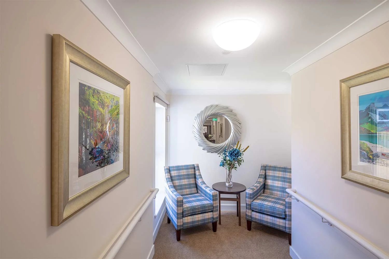
When we think of the home environment, we associate it with feeling safe, secure and reassured – all emotions that will help on the road to recovery. In light of this, the care industry should mimic these feelings through the use of colour, in order to put their patients at ease, helping them to relax and feel at home.
Tonal detail
Corridors can often be rather confusing places and when you are in a new place for the first time you can easily take a wrong turn and end up lost!
Dividing corridors up with distinctive colours i.e. painting the doors and skirting boards, will help keep people on the right path and confirm which department or area of the building they are in.
Colour in contrast
In care homes for dementia sufferers, the vibrancy and contrast of colours is vital. Research has revealed how simply changing the colour of a toilet seat by 30% to the rest of the toilet helps dementia suffers to clearly see where they should sit which helps decrease their chances of having an accident.
Textures – tactile and visually stimulating
A tactile environment can be largely beneficial for young children, so children’s wards that are brightly coloured and ooze vibrancy are going to be far more interesting and engaging, with different textures adding a whole new dimension to the room.
Use a similar colour pallet
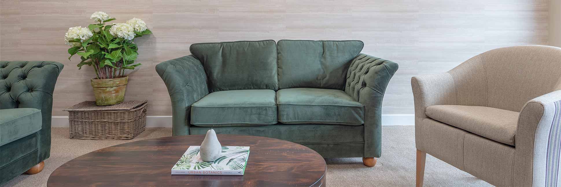
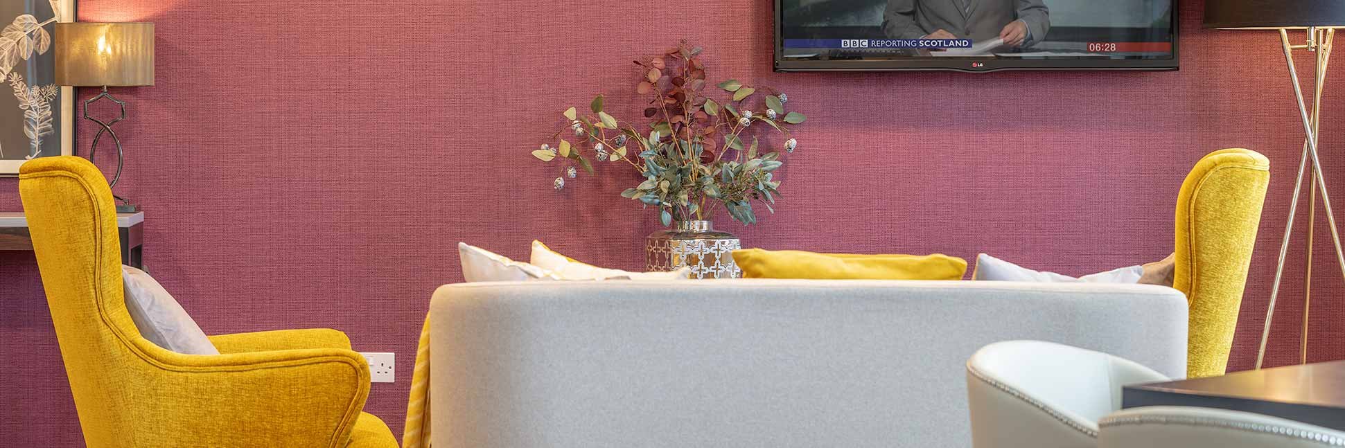
If you think of each colour as holding an emotion, mixing colours up too much will cause confusion and unease so it’s far better to stick to a similar colour pallet for each room, ward etc. choosing colours that complement each other well and create the emotion you want to stir in patients. For instance, in a residential home, the rooms should be fresh and as light as possible; therefore a softer colour pallet with blues and creams would be good to calm and relax, with different tones to highlight areas such as doors and cupboards.
Colours and their effects
When exploring the world of colours, you can find that there is much more to be discovered than you first might think. So if you’re in the care industry, you’ve now got some ideas so you don’t just have to stick to the same old, meaningless colours. You could even go one step further and have backdrops, ceiling art and mood lighting to liven up the space and challenge the stereotype that care homes are boring places!
Orange: Comfort, warmth, passion, and can stimulate the appetite and mental activity.
Blue: Intelligence, trust, serenity, calm.
Red: Energetic, powerful, strength, stimulation.
Yellow: Joy, happiness, intellect and energy.
Green: Nature, growth and recovery.
Pink: Love, femininity, nurture, sexuality.
Photography: Studiovhf

